Icône ou SVG qui bounce
[css]
/* FLECHE BOUNCE */
.fleche img {
height: 26px;
width: 40px;
margin-top: -100px;
margin-bottom: 50px;
}
.bounce {
-moz-animation: bounce 2s infinite;
-webkit-animation: bounce 2s infinite;
animation: bounce 2s infinite;
}
@keyframes bounce {
0%, 20%, 50%, 80%, 100% {
transform: translateY(0);
}
40% {
transform: translateY(-30px);
}
60% {
transform: translateY(-15px);
}
}
[/css]
Animation du menu
[css]
/* Headers animations */
.header-animation {
transform: translateY(-110vh);
transform-origin: top;
animation: move-down ease 1.4s forwards;
animation-delay: 0s;
}
.header-animation .wpb_wrapper {
opacity: 0;
animation: fade-in-up ease 0.8s forwards;
animation-delay: 1.6s;
}[/css]
[css]
/* Menu animations */
.l-header {
transform: scaleX(0);
transform-origin: left;
animation: grow-left cubic-bezier(0.785, 0.135, 0.15, 0.86) 0.5s forwards;
animation-delay: 0.4s;
}
.l-subheader-cell {
display: flex;
align-items: center;
flex-grow: 1;
margin-left: -60px;
}
@media screen and (max-width: 1115px){
.l-subheader-cell {
display: flex;
align-items: center;
flex-grow: 1;
margin-left: 0px;
}
}[/css]
Animation des items du menu
[css]
/* Menu animations */
.l-header {
transform: scaleX(0);
transform-origin: left;
animation: grow-left cubic-bezier(0.785, 0.135, 0.15, 0.86) 0.5s forwards;
animation-delay: 0.4s;
}
.l-subheader-cell {
display: flex;
align-items: center;
flex-grow: 1;
margin-left: -60px;
}
@media screen and (max-width: 1115px){
.l-subheader-cell {
display: flex;
align-items: center;
flex-grow: 1;
margin-left: 0px;
}
}
.l-subheader-h {
opacity: 0;
animation: fade-in-right ease 0.4s forwards;
animation-delay: 0.8s;
}
/* Menu principal animations */
.element-1 {
opacity: 0;
animation: fade-in-up ease 0.8s forwards;
animation-delay: 0.5s;
}
.element-2 {
opacity: 0;
animation: fade-in-up ease 0.8s forwards;
animation-delay: 0.6s;
}
.element-3 {
opacity: 0;
animation: fade-in-up ease 0.8s forwards;
animation-delay: 0.7s;
}
.element-4 {
opacity: 0;
animation: fade-in-up ease 0.8s forwards;
animation-delay: 0.8s;
}
.element-5 {
opacity: 0;
animation: fade-in-up ease 0.8s forwards;
animation-delay: 0.9s;
}
.element-6 {
opacity: 0;
animation: fade-in-up ease 0.8s forwards;
animation-delay: 1.0s;
}
.element-7 {
opacity: 0;
animation: fade-in-up ease 0.8s forwards;
animation-delay: 1.1s;
}
.element-8 {
opacity: 0;
animation: fade-in-up ease 0.8s forwards;
animation-delay: 1.2s;
}
.element-9 {
opacity: 0;
animation: fade-in-up ease 1.3s forwards;
animation-delay: 1.0s;
}
@media screen and (max-width: 900px){
/* Padding premier item */
.element-1 {
margin-top:20px !important;
}
}
/* Headers animations */
.header-animation {
transform: translateY(-110vh);
transform-origin: top;
animation: move-down ease 1.4s forwards;
animation-delay: 0s;
}
.header-animation .wpb_wrapper {
opacity: 0;
animation: fade-in-up ease 0.8s forwards;
animation-delay: 1.6s;
}
[/css]
[css]
/* Headers animations */
.header-animation {
transform: translateY(-110vh);
transform-origin: top;
animation: move-down ease 1.4s forwards;
animation-delay: 0s;
}
.header-animation .wpb_wrapper {
opacity: 0;
animation: fade-in-up ease 0.8s forwards;
animation-delay: 1.6s;
}
/* Animations */
@keyframes fade-in-right {
from {
opacity: 0;
transform: translateX(-16px);
}
to {
opacity: 1;
transform: translateX(0);
}
}
@keyframes fade-in-up {
from {
opacity: 0;
transform: translateY(64px);
}
to {
opacity: 1;
transform: translateY(0);
}
}
@keyframes grow-left {
from {
transform: scaleX(0);
}
to {
transform: scaleX(1);
}
}
@keyframes grow-down {
from {
transform: scaleY(0);
}
to {
transform: scaleY(1);
}
}
@keyframes grow-up {
from {
transform: scaleY(1);
}
to {
transform: scaleY(0);
}
}
@keyframes move-down {
from {
transform: translateY(-110vh);
}
to {
transform: translateY(0);
}
}
.facebook {
opacity: 0;
animation: fade-in-up ease 0.8s forwards;
animation-delay: 1.1s;
}
.instagram {
opacity: 0;
animation: fade-in-up ease 0.8s forwards;
animation-delay: 1.2s;
}
.pinterest {
opacity: 0;
animation: fade-in-up ease 0.8s forwards;
animation-delay: 1.3s;
}
.linkedin {
opacity: 0;
animation: fade-in-up ease 0.8s forwards;
animation-delay: 0.4s;
}
.animate .animate-element{
display: none;
}
.animateme .animate-element{
display: block !important;
}
[/css]
Parallax backgrounds
[css]
/* Parallax-background ajouter la classe où il y a le background */
.parallax-background {
overflow: hidden !important;
}
.parallax-background .vc_column-inner {
position: relative !important;
width: 100% !important;
margin-top: -150px !important;
margin-bottom: -150px !important;
}
[/css]
[css]
/* Parallax */</pre>
@media (min-width: 1025px) {
.parallax {
position: relative;
overflow: hidden;
}
.parallax .vc_column-inner {
position: absolute;
top: 0;
left: 0;
right: 0;
bottom: -10%;
}
}[/css]
Items du menu en bouton on Hover
[css]</pre>
<div>
<div>/* Menu HOVER */</div>
<div></div>
<div>@media screen and (min-width:1701px) {</div>
<div>.w-nav-anchor:hover .w-nav-title {</div>
<div>background-color: #40915F;</div>
<div>color: #fff;</div>
<div>-webkit-transition: all .4s ease;</div>
<div>-moz-transition: all .4s ease;</div>
<div>-ms-transition: all .4s ease;</div>
<div>-o-transition: all .4s ease;</div>
<div>transition: all .4s ease;</div>
<div>}</div>
<div></div>
<div>.w-nav-title {</div>
<div> padding: 10px 20px;</div>
<div> border-radius: 30px;</div>
<div>}</div>
<div>}</div>
</div>
<pre>[/css]
Blurred sticky menu
[css]</pre>
<div>/* Rend le sticky blurred */</div>
<div>.l-header.bg_transparent.sticky .l-subheader.at_middle {</div>
<div>-webkit-backdrop-filter: blur(10px);</div>
<div> backdrop-filter: blur(10px);</div>
<div>}</div>
<div></div>
<div>.w-nav.type_mobile.m_layout_fullscreen .w-nav-control.active + .w-nav-list.level_1 {</div>
<div>-webkit-backdrop-filter: blur(10px);</div>
<div> backdrop-filter: blur(10px);</div>
<div>}</div>
<pre>[/css]
Blurred image background

[css]
.w-image-shadow {
position: absolute;
top: 15%;
left: 5%;
right: 5%;
height: 90%;
background-size: 200% 80%;
background-position: center bottom;
background-repeat: no-repeat;
border-radius: inherit;
-webkit-filter: blur(25px);
filter: blur(25px);
}
[/css]
Flèches de carrousel rondes
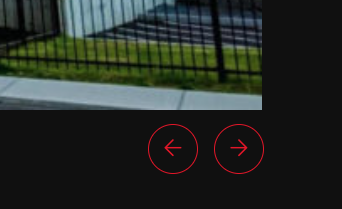
[css]
.owl-nav {
position: absolute;
right: 3rem;
bottom: 1.5rem;
}
.owl-nav button {
height: 50px;
width: 50px;
}
.owl-nav button::before,
.owl-nav button::after {
content: '';
position: absolute;
top: 0;
left: 0;
right: 0;
bottom: 0;
border-radius: 50%;
}
.owl-nav button::before {
border: 1px solid var(–color-content-border);
transition: all 0.3s ease;
}
.owl-nav button::after {
display: flex;
justify-content: center;
align-items: center;
padding: 0;
font-weight: 100;
font-size: 1.2rem;
color: var(–color-content-border);
transition: all 0.3s ease;
}
.owl-nav button.owl-prev {
right: 1rem !important;
}
.owl-nav button.owl-prev::after {
content: '\f060';
}
.owl-nav button.owl-next::after {
content: '\f061';
}
.owl-nav button:hover::before {
background-color: var(–color-content-border);
border: none;
}
.owl-nav button:hover::after {
color: var(–color-alt-content-text);
}
.owl-stage .w-post-elm._wp_attachment_image_alt {
font-size: var(–step-1);
width: 100%;
text-align: left;
margin-top: var(–space-m);
}
.owl-stage .w-post-elm-value {
font-size: var(–step-1);
}
.owl-stage .w-grid-item-h .w-vwrapper {
padding: 0 !important;
}
[/css]